The redesign of gladstone.org from the ground up
Gladstone's new homepage with a hero video that ties into its clean, vibrant look, using updated brand elements and lab footage to showcase aspects of Gladstone’s culture and scientific community
Challenge
Gladstone’s website, originally built in the 2000s, no longer reflected the innovation and creativity at the heart of its research. The site’s outdated architecture and visual design failed to capture the organization’s evolving scientific focus, institutional structure, and strategic priorities.
In addition to a lack of alignment with the brand, the limitations of the platform made it difficult to share new research, promote events, and connect with key audiences such as donors, collaborators, and prospective recruits.
Solution
I led the visual and UX design of the new website, expanding on an initial system created by an external agency. I adapted the design language to support Gladstone’s content strategy and user needs, ensuring clarity, accessibility, and consistency across the site.
I created responsive templates, UI components, and interaction patterns, and collaborated with stakeholders to improve user flows and content hierarchy. The result was a more intuitive, engaging experience for both scientific and general audiences.
Outcomes
The redesigned website significantly improved Gladstone’s digital presence, making it easier for users to explore research, navigate lab groups, and access news and events. The refreshed design and updated structure now reflect the organization’s credibility, creativity, and scientific ambition.
The site reaches over 267,000 active users annually—a ~73% increase in direct traffic. Overall, the platform now serves as a stronger tool for engagement, storytelling, and strategic outreach.
Role
UX/UI
Tools
Figma/PhotoShop
Homepage
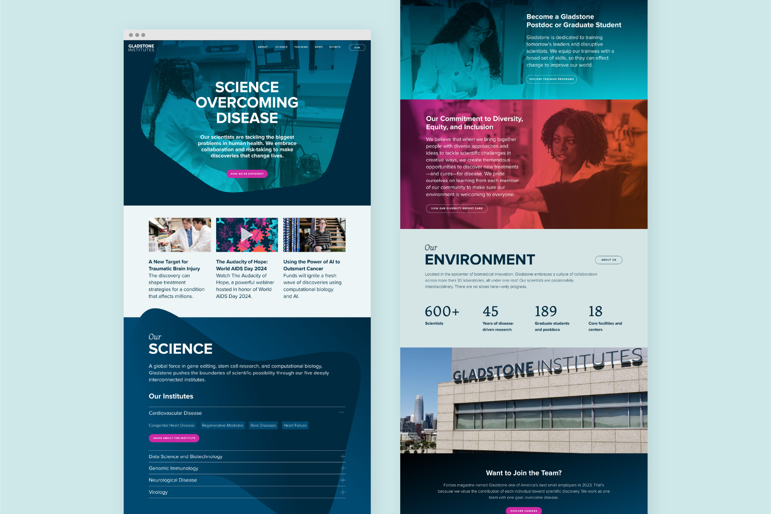
Using an accordion menu for the many disease areas Gladstone studies economises on space, and allows the user to navigate through the page more easily
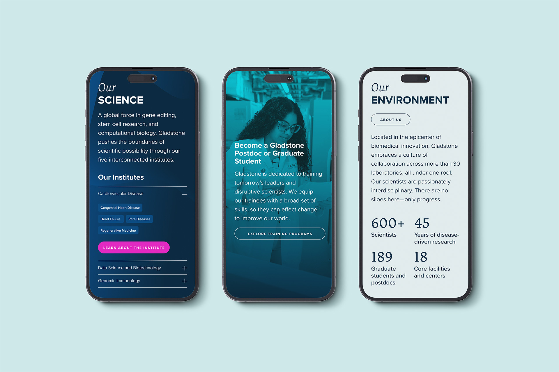
Background photography adds interest and brings the page to life while reinforcing the message of the text, and statistics in big type increase page skimmability
Sub-landing Pages
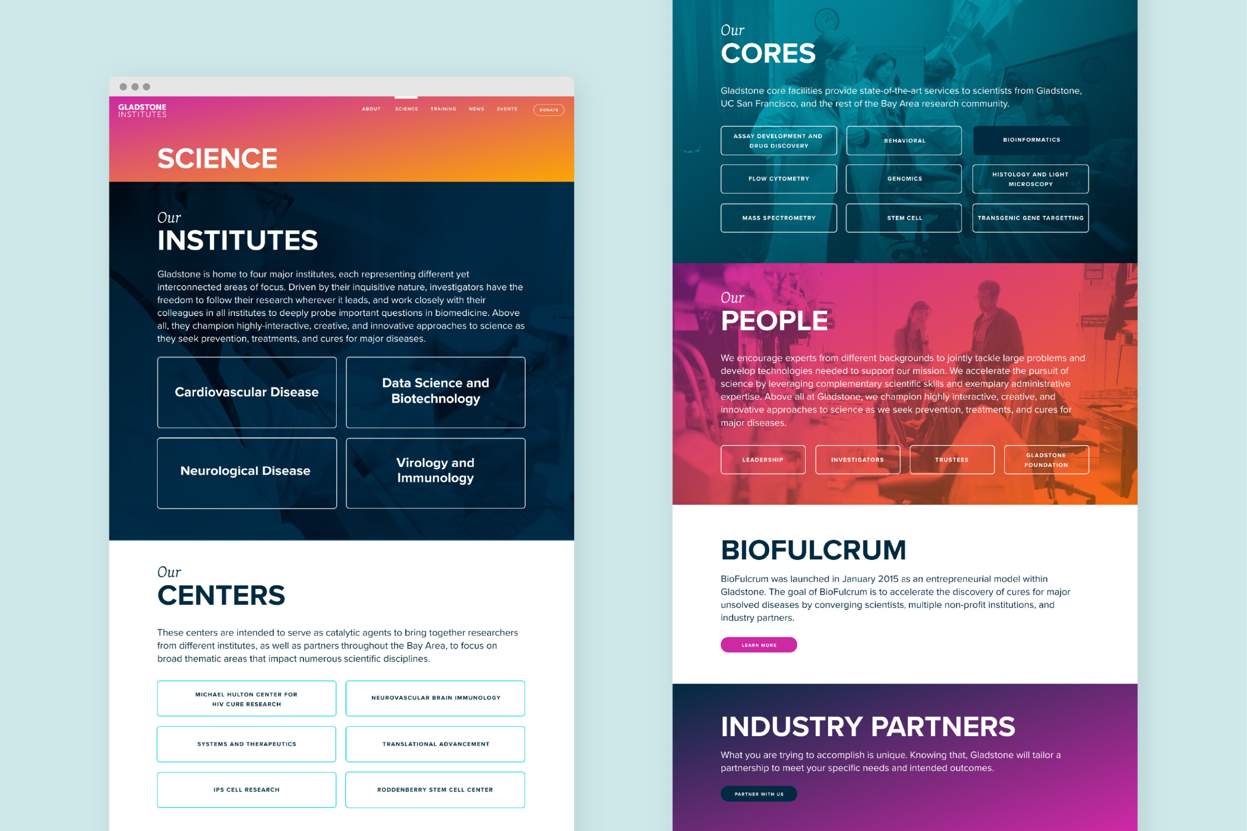
I determined sub-landing pages were needed to allow visitors to navigate the wealth of content on the site. This page helps users navigate through the different scientific content types
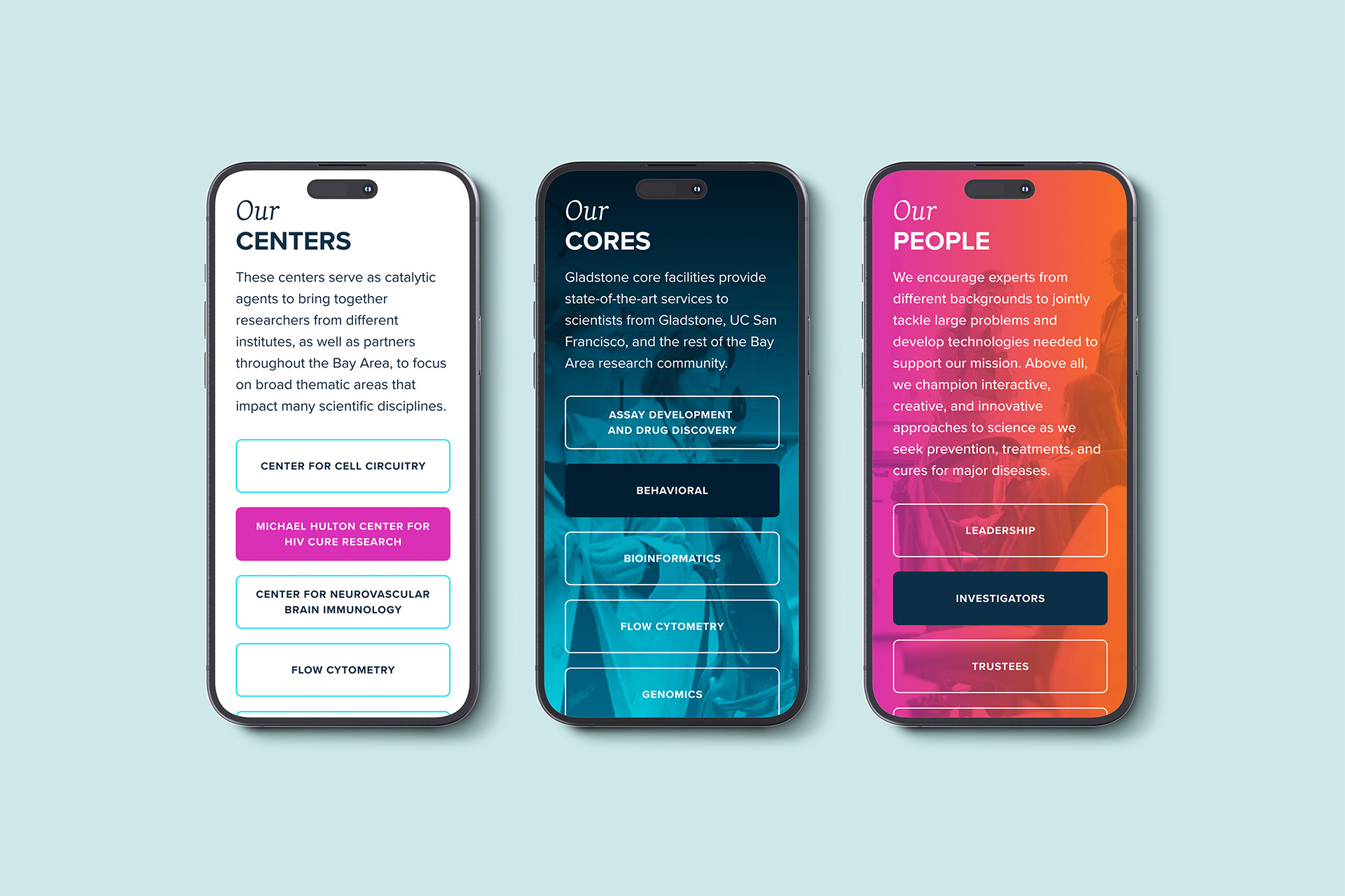
The core services have their own section here to drive traffic to their webpages, important as they are funded by their own revenue streams
News Pages
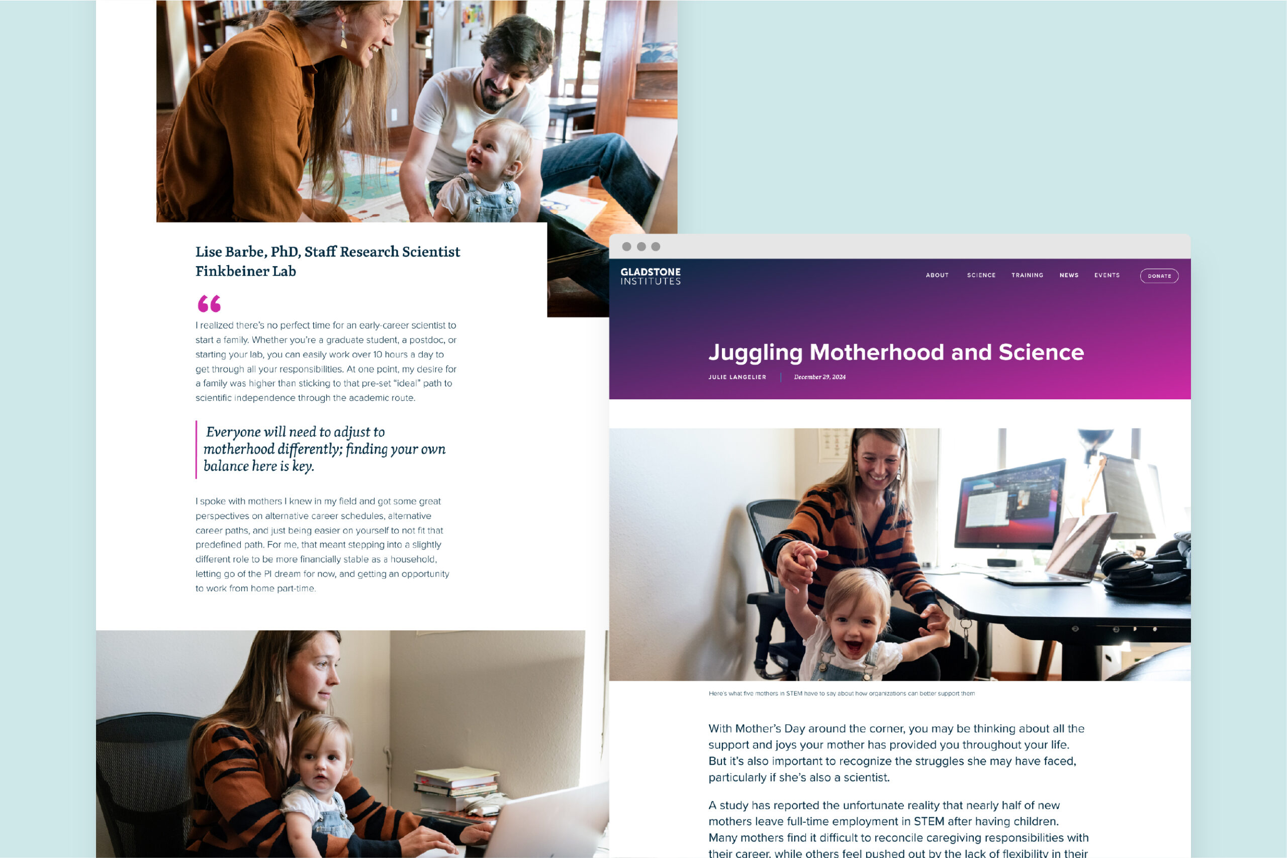
I partly overlaid the images with copy to create a look that is distinct from the other content pages on the website
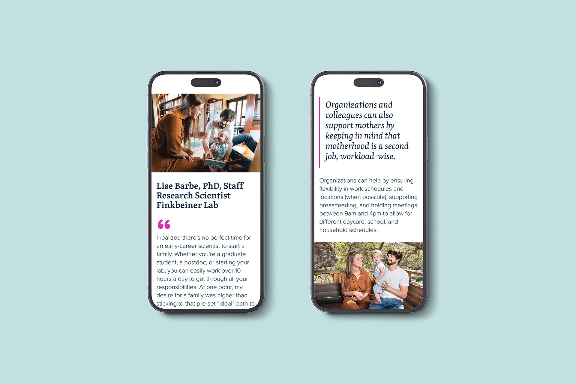
Pull quotes highlighting key points help to draw the reader in, and graphical elements like large quotation marks create a more editorial look
Content Pages: Inclusivity
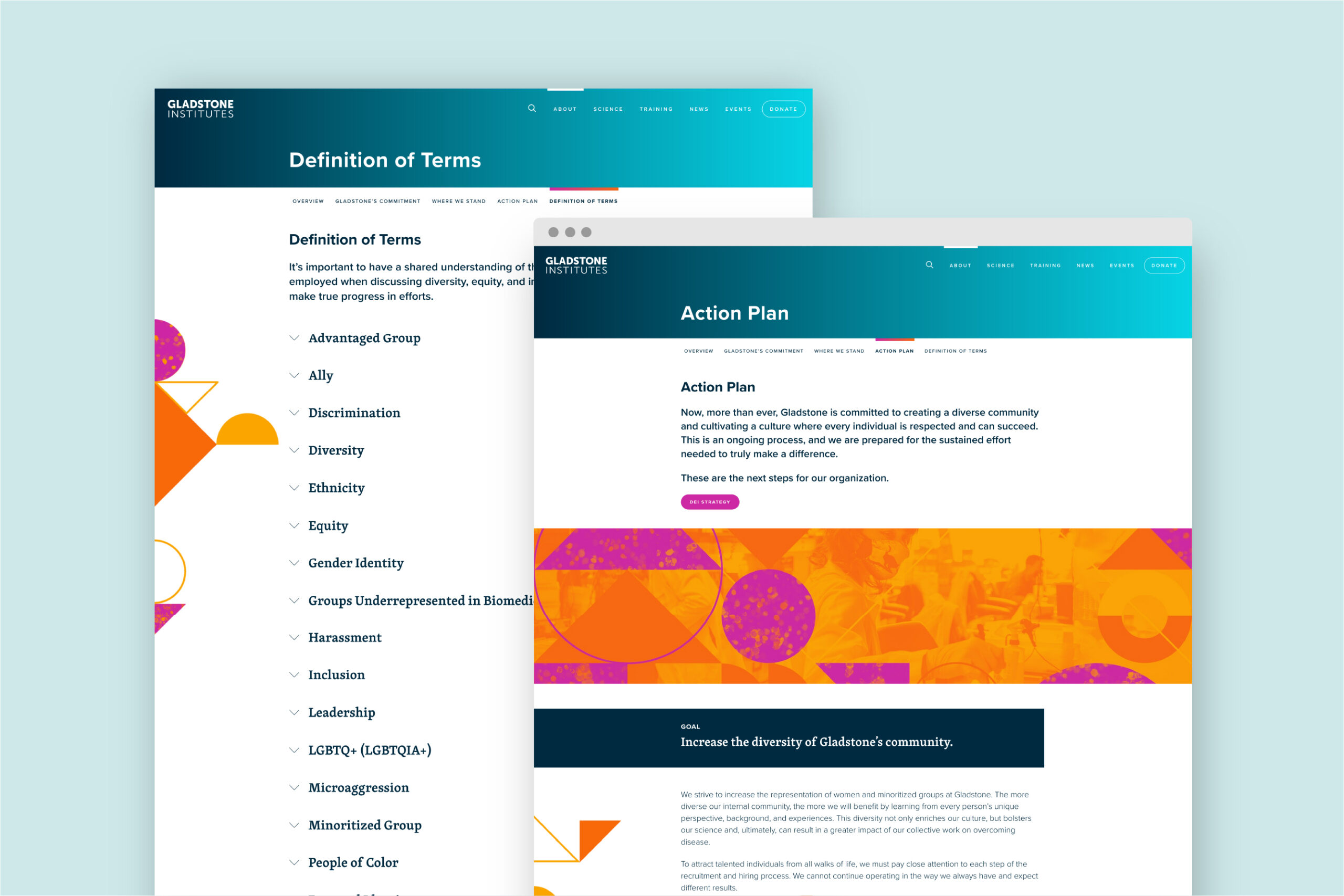
I used geometrical design elements to represent the theme of inclusivity, which also help to guide the user down the page
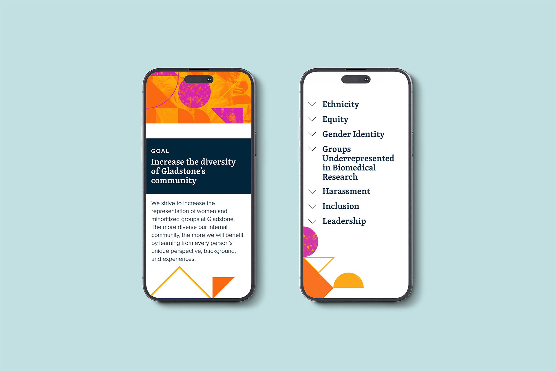
Contrasting backgrounds and drop down menus help to break up the page and prevent users from being overwhelmed with large amounts of copy
Want to talk? Drop me a line.
Copyright © 2025 Sarah Gardner