
Gladstone’s 40th Anniversary Year
Challenge
In 2019, Gladstone Institutes marked its 40th anniversary with a year-long series of events, including symposiums, lectures, and a celebratory dinner for major donors. The milestone was an opportunity to spotlight Gladstone’s scientific achievements and strengthen relationships with both the scientific community and philanthropic supporters.
The central design challenge was finding a visual language that felt celebratory without being generic.
The primary goal was to create a cohesive and engaging visual identity for the anniversary that would unify the events under a single look, raise visibility, and support fundraising efforts by appealing to diverse audiences across disciplines.
Solution
I explored a range of directions (starburst treatments, typographic approaches, a concept where the "40" emerged from the background as a metaphor for discovery) before landing on something more conceptually grounded.
The solution was a motif I called the "pathway to discovery", a dashed line pattern referencing the graphs, interactomes, and network visualisations that are native to data science. The lines curve and swoop organically, referencing both biological forms and the non-linear nature of scientific discovery itself — the idea that breakthroughs rarely follow a straight line.
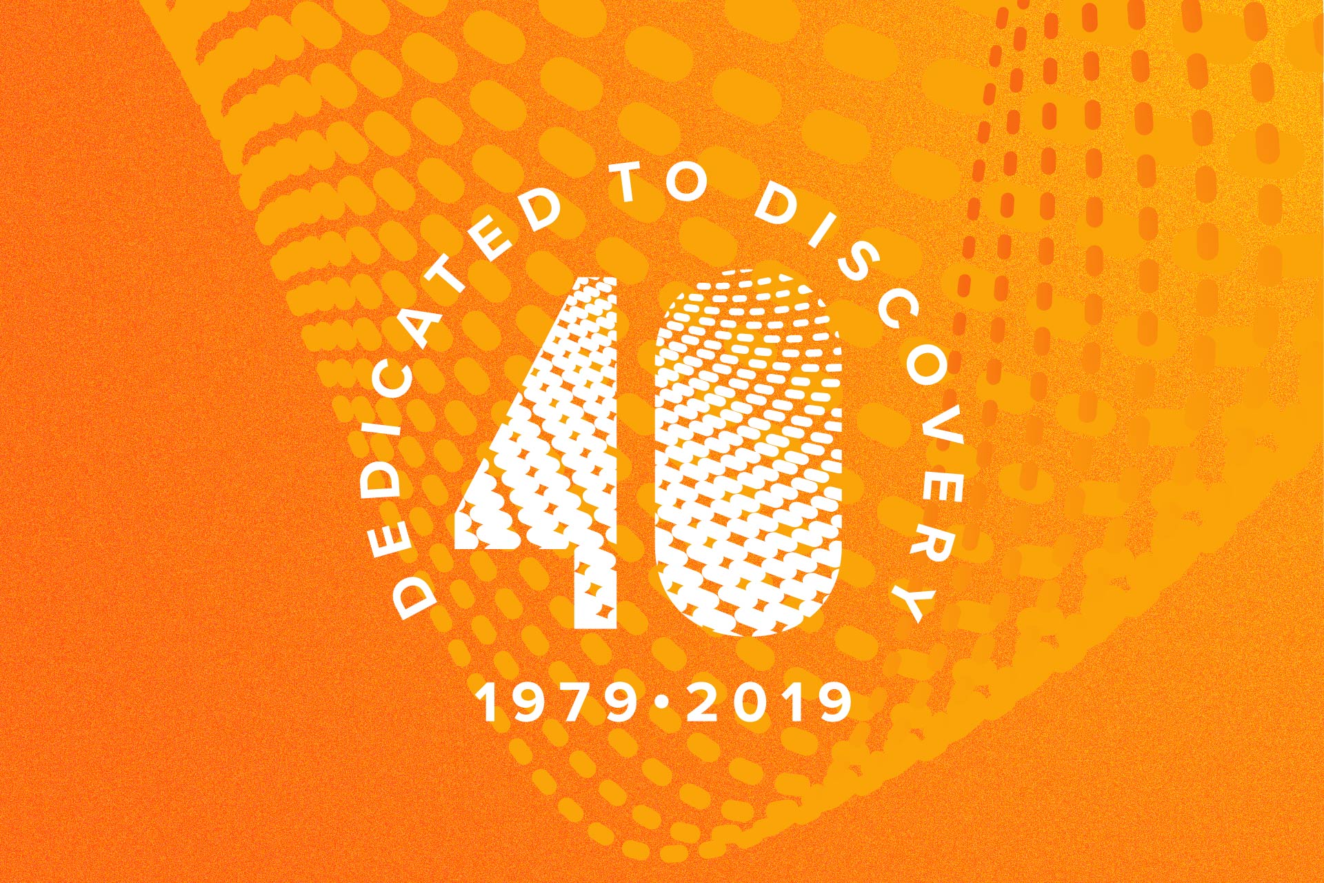
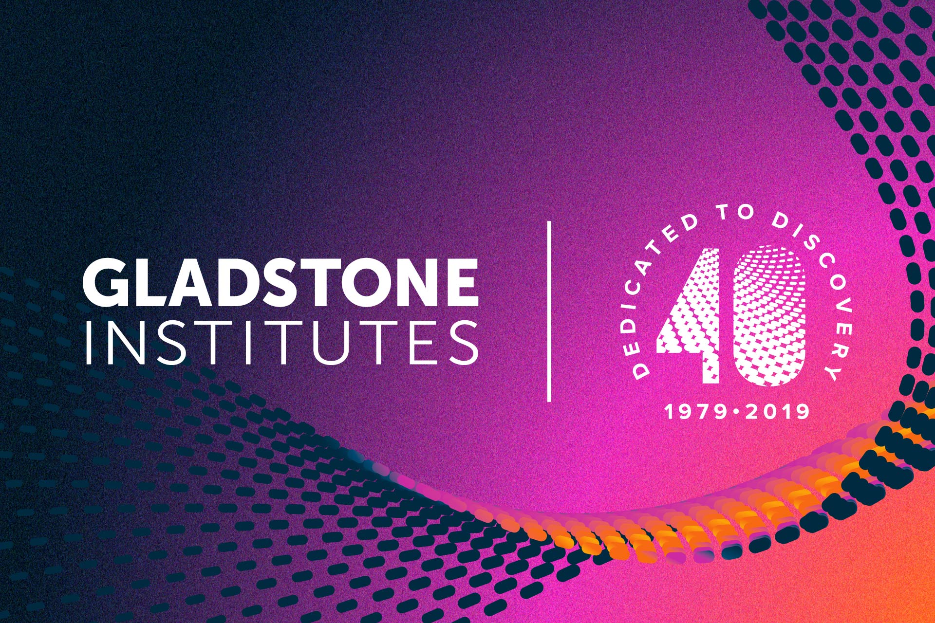
I incorporated this motif into a custom seal embedding the "40," Gladstone's name, and the founding years 1979–2019. The emblem became the anchor for the full year of materials, applied across street banners, symposium branding, donor events, and internal communications — flexible enough to work across contexts while remaining immediately recognizable.
Outcomes
The anniversary branding created a strong and cohesive presence across all materials, helping to unify multiple events and initiatives throughout the year. It contributed to increased engagement from both donor and scientific audiences by making the events feel part of a larger, purpose-driven celebration.
The design system was successfully applied to two major symposiums, a high-profile donor dinner, internal communications, external media, promotional giveaways, building signage, and a print ad campaign, demonstrating the flexibility and reach of the identity across channels.
Role
Logo/identity design | All print and digital design
Tools
InDesign/Photoshop/Illustrator
Logo Lock-Up
Emblem Explorations

Initial emblem design explorations

Explorations based on “pathway” concept
Street Banners

Banners designed for the light poles outside Gladstone’s offices. They stayed up for the full anniversary year

North West-facing view on Owens Street in San Francisco’s Mission Bay
Science Symposium
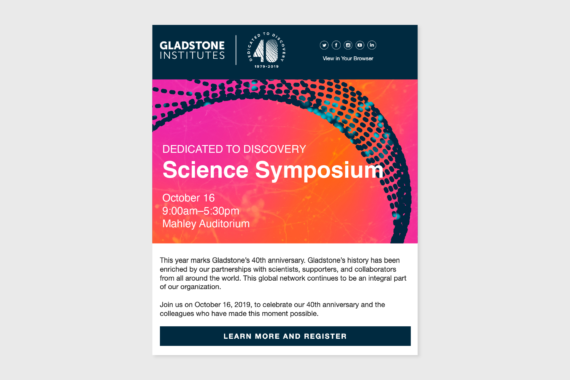
One of the email campaigns sent to 2000+ recipients
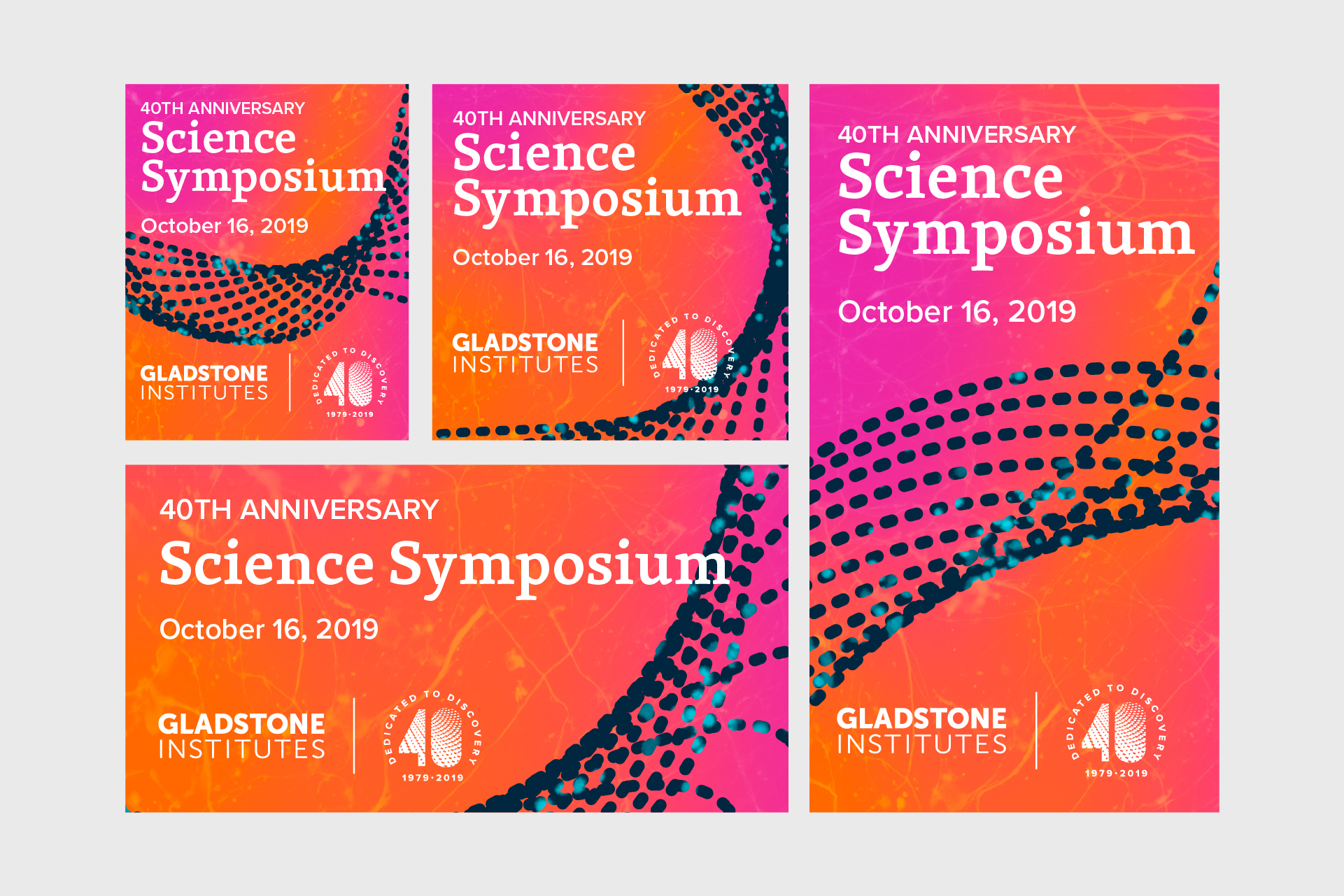
The social media campaign used across multiple channels
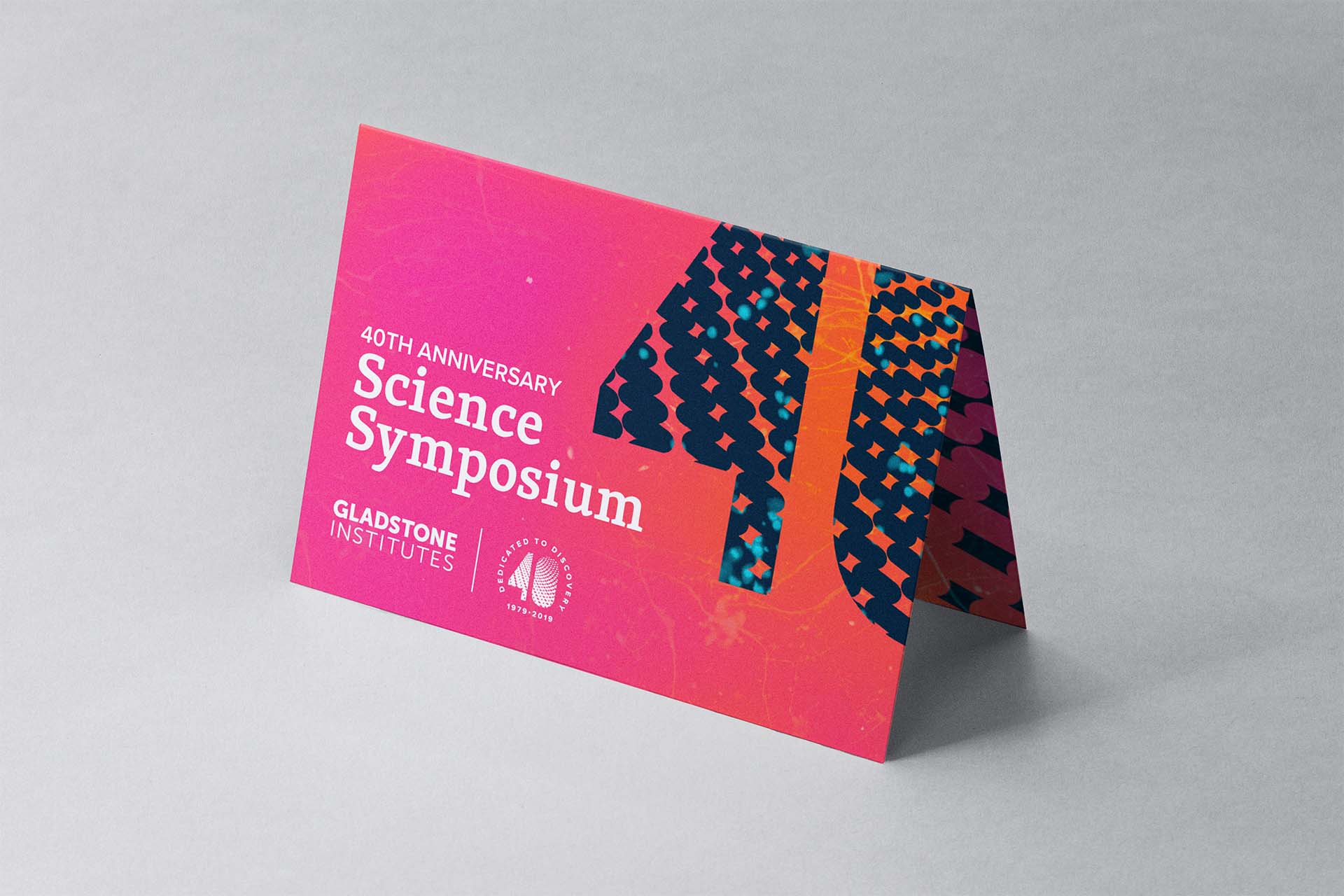
A print invitation was created to connect with Gladstone’s philanthropy audience
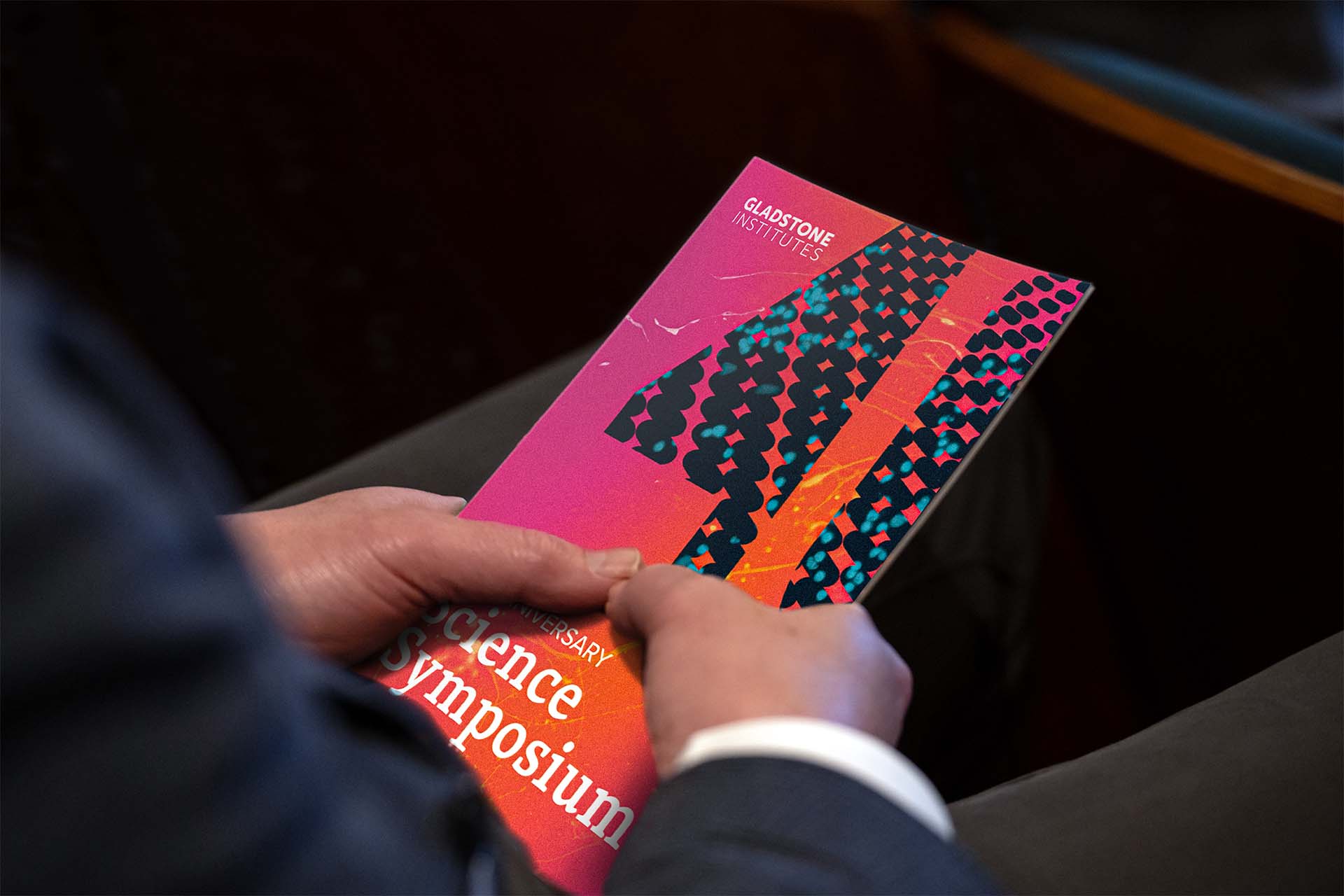
The printed programme given out onsite at Gladstone’s offices
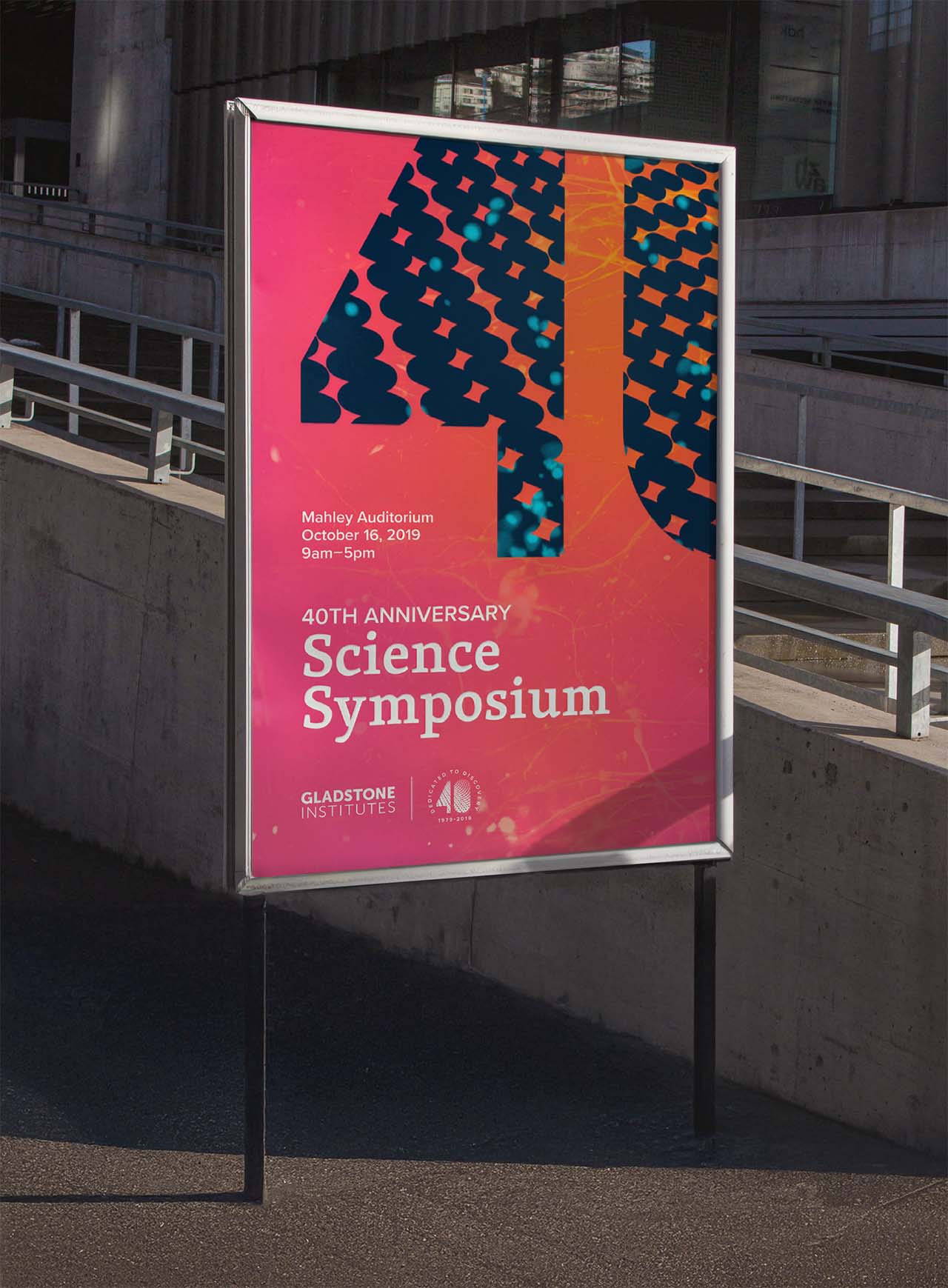
Exterior wayfinding signage
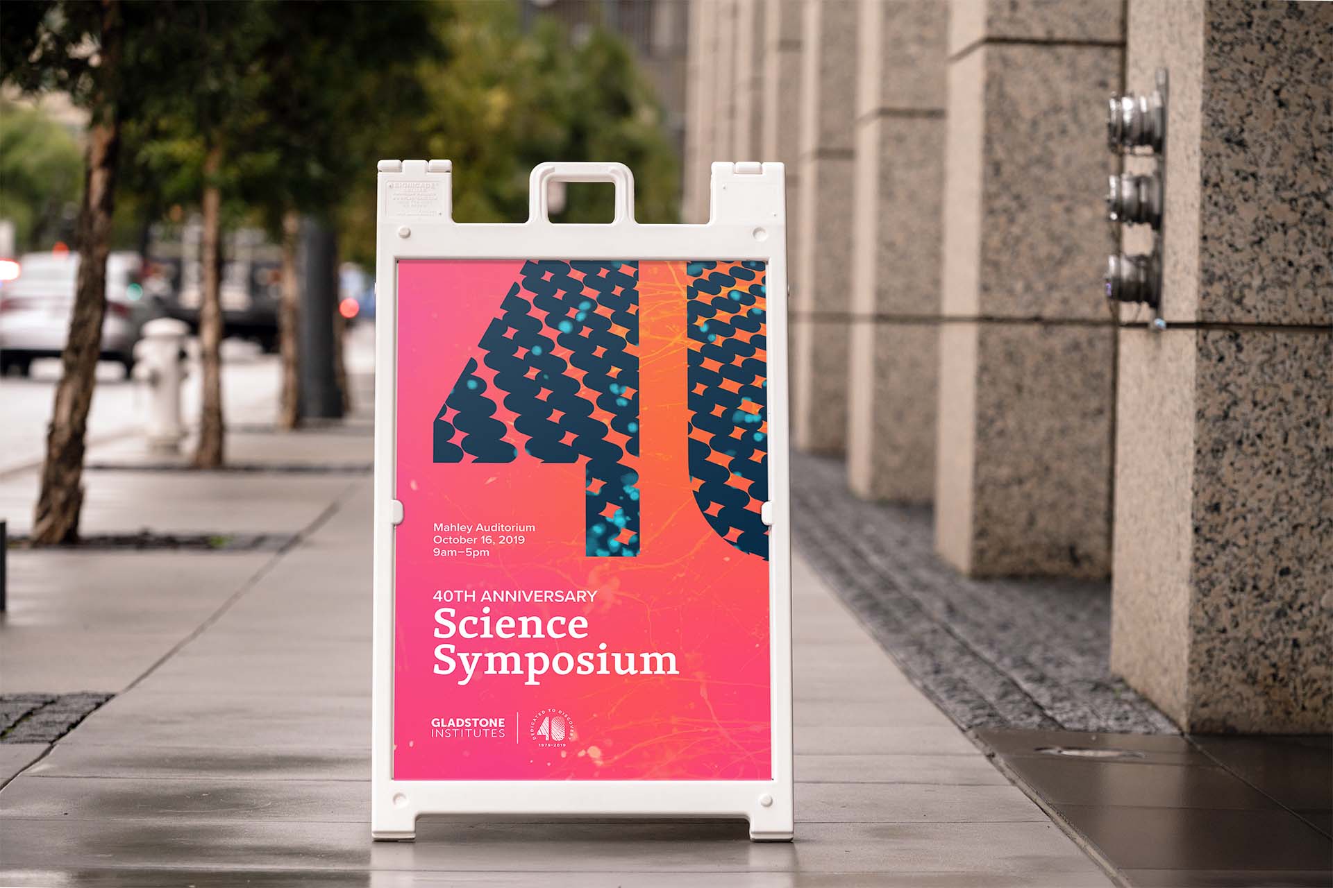
Exterior wayfinding signage
Celebratory Dinner

Printed elements at the donor dinner in San Francisco

The programme included quotations from Gladstone’s own scientists designed to connect with the donor audience

Name tag and pin badge worn by an attendee at the dinner

The enamel pin badge given to donors and other stakeholders
Want to talk? Drop me a line.

Copyright © 2026 Sarah Gardner